Why Marble Colors Behave Differently from Project to Project
“Why does the same marble color look serene in one project, luxurious in another, and completely wrong in a third?”
That question comes up more often than architects, developers, and homeowners expect. A white marble that feels clean and expansive in a city apartment may feel cold in a hotel lobby. A beige marble that looks warm and refined in an estate interior may disappear in a brightly lit retail space. A grey or wood-grain marble that feels grounded and sophisticated in one villa may look too muted in a contemporary commercial setting. Choosing Colori del marmo is not just a matter of taste. It is a decision shaped by light, project type, traffic level, maintenance expectations, scale, and long-term design relevance.
That is why the smartest buyers no longer ask, “What is the most beautiful marble color?” They ask, “What is the right marble color for this project?” That shift matters. Recent kitchen and interior trend reporting tied to the NKBA 2026 report shows just how influential lighting and mood have become in space planning: 95% of homeowners prioritize natural lighting, 93% quality lighting, and 92% task lighting, while industry reporting also points to warmer palettes and more dramatic natural-stone looks, including earthy beiges and deeper blacks, in current interiors. In other words, stone color is no longer a background decision. It is a core part of how a project reads and performs visually.
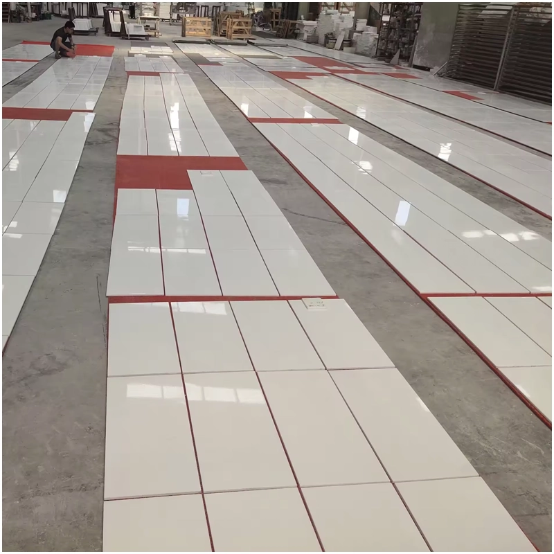
For buyers working with a supplier that understands both stone production and project application, it helps to begin with FOR U STONE’s background and marble project experience. FOR U STONE describes itself as an experienced quarry owner, natural stone manufacturer, and exporter in China, with over 15 years in the industry and a 10,000+ sqm inventory in Shuitou Stone Zone. That kind of scale matters because color selection is rarely solved by mood boards alone; it depends on actual slab availability, finish options, consistency, and application knowledge.

Why Marble Color Selection Has Become More Strategic
A decade ago, many buyers chose marble colors mainly by trend, by showroom impact, or by what looked “luxury enough.” Today the process is more strategic. Designers have to think about color temperature, sustainability narratives, visual longevity, hospitality wear patterns, resale value, and how natural stone will behave under real lighting rather than just under polished gallery lamps.
That is one reason a broader collezione di marmo is more useful than falling in love with a single slab too early. FOR U STONE presents its marble section as a large-format sourcing environment rather than a narrow product page, which is the right mindset for project-based buying. Stone selection, especially color selection, works best when buyers compare families of tone and veining instead of chasing one photogenic sample and hoping it will carry an entire scheme.
The Natural Stone Institute’s 2024 Dimension Stone Design Manual reinforces this more disciplined approach. It describes stone selection as involving application-specific considerations such as finish, physical and mechanical properties, samples, mockups, and the design conditions of the final installation. In short, color choice should never be isolated from context. A good marble color in the wrong application is still a bad decision.
Start With the Project Type, Not the Trend
Before comparing white, beige, grey, or dramatic dark marbles, define the project itself. That sounds obvious, yet it is where many color mistakes begin.
A residential project usually needs comfort, familiarity, and aging grace. A luxury hotel wants atmosphere, recognizability, and visual drama under controlled lighting. A commercial office may need neutrality, professionalism, and easier visual maintenance. A villa often rewards warmer, richer, more layered tones that feel grounded rather than sterile.
That is why a buyer should explore marble colors by category before making a final shortlist. The category approach is useful because it pushes the conversation away from “Which slab is pretty?” and toward “Which color family belongs in this setting?” That is a much smarter question.
A practical way to frame the decision
Ask these five questions first:
-
Is the project residential, hospitality, retail, office, or mixed-use?
-
Is the space meant to feel bright, warm, calm, dramatic, or timeless?
-
How much natural light does the space actually receive?
-
Will the stone be used on floors, walls, countertops, vanities, stairs, or feature panels?
-
Does the client want a timeless interior or a trend-driven statement?
If you skip those questions and jump straight to slab photos, you are not choosing a marble color. You are gambling with one.
White Marble: The Reliable Classic That Still Refuses to Retire
There is a reason white marble keeps returning to the top of project lists. It reflects light, enlarges space visually, and pairs with nearly every mainstream design language, from classic luxury to quiet minimalism. White marble remains especially strong in apartments, bathrooms, kitchens, and hospitality projects where brightness and perceived cleanliness matter.
That is why a dedicated serie marmo bianco is not just a product grouping; it is effectively a toolkit for timeless design. White marble works across modern, transitional, neoclassical, and even high-contrast interiors because it gives the designer room to control mood through cabinetry, metals, lighting, and furnishing layers rather than through the stone alone.
FOR U STONE’s recent article on perché il marmo bianco funziona ancora così bene nelle case reali points in the same direction. The theme of that piece is not “white marble is trendy.” It is that white marble keeps working because it adapts to real domestic life better than trend cycles would suggest. That is an important distinction. A timeless stone keeps functioning after Instagram moves on.
White marble is particularly effective when a project needs one or more of these outcomes:
-
more visual brightness
-
a cleaner architectural read
-
a premium but not overpowering backdrop
-
stronger resale friendliness
-
easier pairing with wood, black metal, brass, or soft neutral fabrics
The catch, of course, is that white marble asks for honesty. If the project involves heavy staining risks, aggressive use, or owners who panic at every tiny etch, then the right white marble finish and application must be chosen with care. But that is not a white-marble problem. That is a lifestyle-fit problem.

Beige Marble: The Quiet Workhorse for Estate and Hospitality Warmth
If white marble is the obvious classic, beige marble is the underrated professional. It does not usually scream for attention, which is exactly why it succeeds so often in villas, estate interiors, clubhouses, and hospitality settings. Beige marble warms a space without darkening it, and it softens large rooms that would otherwise feel too hard or overly monochrome.
FOR U STONE’s article on i 4 migliori colori di marmo beige per i progetti di interni immobiliari is useful because it frames beige not as a compromise color, but as a strategic one. The page describes beige marble as warm, inviting, versatile, and suitable for flooring, wall cladding, countertops, stairs, and columns, especially in high-end residential and commercial interiors. That lines up with how beige behaves in real projects: it creates elegance without visual noise.
Beige marble usually performs best when the project needs:
-
a warmer visual temperature
-
more classical or estate-like character
-
hospitality softness rather than gallery starkness
-
easier integration with wood, bronze, cream, taupe, and warm lighting
-
a timeless base that does not rely on high-contrast drama
One of beige marble’s biggest strengths is that it is forgiving. It does not polarize clients as quickly as some greys or blacks do. It can make large spaces feel more humane. It also tends to age gracefully because warm neutrals rarely become visually exhausting. Beige is not the show-off at the design party. It is the guest who somehow ends up owning the house.
Grey Marble: The Flexible Choice for Calm, Modern Spaces
Grey marble sits in a strategic middle ground. It is cooler than beige, softer than black, and usually easier to live with visually than stark white. That makes it one of the most versatile options for contemporary residences, office lobbies, urban hotels, and mixed-use interiors that need sophistication without excess.
Grey marble is especially effective when the project wants calm rather than spectacle. It pairs naturally with steel, smoked oak, brushed nickel, black-framed glass, and warm indirect lighting. It can feel architectural without becoming severe.
Buyers often overlook how much lighting affects grey stone. The NKBA 2026 numbers on natural and quality lighting are relevant here because grey marble can look dramatically different depending on daylight access and lighting temperature. In a low-light room, a cool grey may feel flat. In a well-lit project with layered warm lighting, the same marble can feel rich, controlled, and elegantly modern.
Grey also helps bridge clients who want something more current than beige but less risky than black. In that sense, it is one of the smartest commercial choices for developers who need a broader appeal without surrendering design credibility.

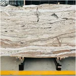
Wood-Grain Marble: When the Project Needs Warmth Without Looking Rustic
Not every project benefits from traditional veining. Some need something subtler, more linear, and more quietly atmospheric. That is where Marmo grigio di legno becomes relevant. FOR U STONE’s recent March 2026 article presents it as a material that offers a rare balance of warmth and elegance through a natural wood-grain effect, which makes sense for interiors that want calm rhythm rather than dramatic movement.
This category works beautifully in:
-
warm modern residences
-
boutique hospitality
-
wellness-oriented interiors
-
feature walls and flooring in spaces that need softness
-
projects where designers want natural character without the busyness of bold veining
Wooden marble is particularly useful when a client loves the emotional warmth of timber but wants the permanence and stone character of marble. It also works well in spaces that need visual directionality, since the grain can subtly guide the eye and elongate a room.

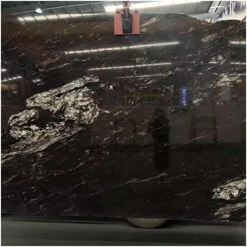
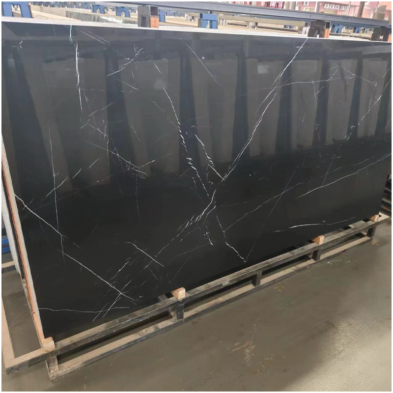
Dark and Dramatic Marble Colors: Strong Identity, Higher Risk, Bigger Reward
Some projects do not need softness. They need a statement. Dark marble colors, including deep greys and blacks, create instant contrast and often become the emotional center of a space. They work especially well in hospitality reception zones, feature bathrooms, executive spaces, wine rooms, bars, and selected residential interiors where the client wants atmosphere.
PER U PIETRA I 10 colori di marmo più venduti is useful here because it reflects a broader market truth: best-selling marble colors are not all safe whites. Stronger, more expressive tones continue to sell because buyers want both flexibility and identity. The same page highlights that marble color bestsellers range from classic selections like Carrara White and Calacatta to darker, bolder options suited to commercial and residential projects alike.
Dark marble’s advantage is memorability. Its disadvantage is that it exposes bad design decisions quickly. If the lighting is poor, the room may feel oppressive. If the detailing is clumsy, the material can read as heavy rather than luxurious. If the maintenance plan is weak, the surface may show visual wear in ways the client did not anticipate. Dark marble is brilliant when supported properly. Without support, it behaves like a very expensive truth teller.
What the Science Says About Appearance and Wear
A lot of buyers talk about marble color as if it were only an aesthetic choice. It is not. Color affects how wear is perceived, how stains register visually, and how changes in gloss or roughness are noticed over time.
A 2022 study on carbonate natural stones commonly used for countertops and wet areas examined Marmara White, Bursa Beige, Emprador, and Kütahya Black after exposure to eight food, beverage, and cleaning materials over 1, 3, and 7 days. The study found significant differences in gloss loss, roughness increase, and total color change depending on the stone and the staining agent. After three staining-cleaning cycles, the black sample showed the highest gloss loss under descaler exposure, while the white sample showed the highest total color change under cooking oil. That matters for designers because it confirms something practical: different marble colors do not merely look different; they reveal damage differently.
This is exactly why project type should guide color choice. A material that looks fantastic in a formal powder room may not be ideal for a fast-moving family kitchen. A beige marble that performs elegantly in a hotel corridor may not give a retail lobby the contrast it needs. Science does not pick the color for you, but it does remind you that appearance and maintenance are inseparable.

A Project-Led Marble Color Matrix
Instead of asking which marble color is “best,” it is more useful to ask which color family is most suitable for each project condition.
| Tipo di progetto | Best Marble Color Direction | Perché funziona | Main Caution |
|---|---|---|---|
| Urban apartment | White or soft grey | Brightens compact spaces and keeps the interior open | Very white tones may show visual wear more obviously |
| Estate villa | Beige, warm grey, or wood-grain marble | Adds warmth, scale, and long-term elegance | Overly cool whites can feel sterile in large rooms |
| Boutique hotel | Beige, grey, dramatic dark accents | Supports atmosphere and layered hospitality design | Strong dark tones need precise lighting |
| Luxury retail | White with bold veining or dark statement marble | Creates instant visual identity and premium feel | Must coordinate with branding and lighting |
| Office lobby | Grey or restrained beige | Professional, timeless, and widely acceptable | Too-safe tones can feel generic without detail |
| Family home | White, beige, or calm grey | Flexible, timeless, and easier to style over time | Finish selection matters as much as color |
Trends Are Useful, but Timelessness Pays the Bills
Trend-aware buyers are not wrong to care about what is current. They just should not confuse relevance with longevity.
FOR U STONE’s article on how to choose marble colors that keep your interiors timeless, not trendy is pointed for a reason. The project risk in many interiors is not choosing a bad color outright. It is choosing a color that ages too fast because it was selected for short-term visual novelty rather than long-term harmony. The strongest marble interiors usually succeed because their color palette can survive changing furniture, lighting updates, and decorative trends.
That does not mean “play it safe forever.” It means knowing where to make the statement. In many projects, the smartest move is to keep major surfaces relatively timeless and let smaller interventions carry more fashion sensitivity. A marble floor, wall, or vanity is not like swapping cushions. Stone decisions linger. Usually longer than the person who approved the mood board.
Sustainability, Compliance, and the New Color Conversation
Here is the part many buyers ignore until procurement gets complicated: marble color selection now intersects with sustainability narratives, sourcing expectations, and evolving policy pressure.
FOR U STONE’s article on Navigare tra le tendenze dei colori del marmo in un panorama politico globale in evoluzione frames marble color not just as a design issue but as part of a broader market conversation involving regulations, eco compliance, and changing buyer expectations. Likewise, its piece on marble colors in modern design explicitly connects aesthetics with sustainability and policy trends. Even without overcomplicating the matter, the message is clear: clients increasingly want materials that are not only beautiful, but also sensibly sourced and aligned with a more transparent project narrative.
The Natural Stone Institute’s 2024 materials also reinforce how seriously the industry now treats standards, sustainability, maintenance, and correct application. That does not mean a designer must become a compliance officer. It does mean color selection is no longer entirely detached from sourcing and performance conversations.
FOR U STONE’s Color Logic in Practice
One reason FOR U STONE’s internal content is useful is that it reflects a practical spectrum rather than a one-note marketing pitch. The site does not tell buyers only that white marble is elegant. It also explores beige estate marbles, wood-grain warmth, best-selling color groups, policy-aware trend shifts, and real-home white-marble relevance. That range is helpful because it mirrors the actual decisions clients face.
You can see that logic in the way the site moves from broad colori del marmo selection to focused educational content, and then back to project-specific thinking. That is a healthier buying path than simply pushing one fashionable look across every application.
In practical terms, FOR U STONE’s content suggests a useful rule of thumb:
-
choose white when the project needs light and timelessness
-
choose beige when the project needs warmth and hospitality
-
choose grey when the project needs calm modern balance
-
choose wood-grain marble when the project needs softness and organic rhythm
-
choose dark dramatic marble when the project needs identity and controlled contrast

Domande frequenti
What is the best marble color for residential projects?
There is no single best answer, but white, beige, soft grey, and certain wood-grain marbles are usually the strongest residential performers because they balance versatility, warmth, and long-term livability. The right choice depends on the light level, room size, and desired mood.
Is white marble still a good choice for modern interiors?
Yes. White marble remains one of the most reliable choices for modern interiors because it reflects light well, pairs with almost everything, and supports both classic and contemporary design schemes. Its strength is not trendiness but adaptability.
Why do beige marble colors work so well in large projects?
Beige marble introduces warmth without overwhelming the space, which is especially useful in villas, estate projects, hotels, and larger public interiors. It tends to create a more welcoming atmosphere than very cool whites or harsher greys.
Are darker marble colors harder to use?
They are not harder, but they are less forgiving. Dark marbles need better lighting, stronger detailing, and more confidence in the overall palette. When done well, they create unforgettable spaces. When done poorly, they can make a room feel heavy.
Should I choose marble color by trend or by project type?
Always by project type first. Trends can help refine the choice, but the best marble color is the one that suits the room’s scale, lighting, use, and long-term design goals. Trends pass. Stone stays.
The Real Value of Choosing Marble Colors by Project Needs
Back to that opening question: why can the same marble color feel perfect in one project and completely wrong in another?
Perché Colori del marmo are never just colors. They are tools. They change the perceived warmth of a room, the way light behaves, the sense of scale, the visibility of wear, and the emotional tone of the project. White marble still wins when brightness, cleanliness, and timeless flexibility matter most. Beige marble remains a powerful answer for estate, hospitality, and warm-luxury environments. Grey marble is often the quiet professional’s choice for modern balance. Wood-grain marble offers warmth with a subtler natural rhythm. Dramatic dark marble rewards bold projects that know how to support it.
The real takeaway is simple: the right shade is not the one that looks best in isolation. It is the one that works hardest for the project. When you are ready to compare options by light, use, scale, finish, and long-term visual performance, the next practical move is to contatto per U STONE and review the marble palette against your actual design brief. Safe choices build ordinary rooms.


