
When Choosing Marble Colors Becomes More Than Just a Trend
“Tell me the truth,” the homeowner said, spreading sample pieces across the island.
“If I pick the wrong marble color now, am I going to hate my kitchen in five years?”
The designer didn’t reach for a trendy name. Instead, she reached for a pencil.
“Not if you stop thinking in ‘fashion seasons’ and start thinking in light, contrast and function. The right marble color isn’t just pretty today; it still feels right after hundreds of dinners, work calls and late-night snacks.”
That’s the real challenge with marble colors: they’re beautiful in photos, but real life happens on top of them. In this guide, we’ll walk through how to choose marble colors that feel calm, high-impact and long-lasting—using real project logic, not just mood-board inspiration.

Why Marble Color Choices Matter More Than Ever
Interior research over the past few years shows the same pattern: homeowners are moving away from short-term trends and toward calmer, “quiet luxury” palettes. Pale marbles, especially soft whites and greys, dominate because they:
-
Reflect light and make rooms feel larger
-
Pair well with both warm and cool metals
-
Allow furniture, art and lighting to become the real focal points
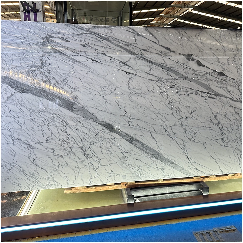
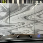
Within this shift, one group of stones stands out: white marbles with subtle grey veining. They offer the brightness of white with just enough pattern to hide day-to-day marks and water spots. That’s why designers so often reach for a classic white marble with gray veins when they need something both photogenic and practical.
But choosing marble colors is more than “light vs dark”. You also need to think about how much contrast your space can handle, where patina will show, and what kind of story you want your stone to tell.
Building a Marble Color Strategy: Light, Medium and Dark
One of the simplest ways to control marble colors is to think in layers: light base, medium accents, and dark grounding elements. This structure keeps your design coherent even as furniture and décor change over time.
| Marble Tone | Typical Examples | Best Used In | Visual Effect | Maintenance Notes |
|---|---|---|---|---|
| Light / Soft White | White marble with gray veins, Ariston-style pure white | Kitchens, bathrooms, hallways, small spaces | Makes rooms feel brighter and larger, clean “gallery” look | Shows dark spills faster (wine, coffee), but easy to spot and clean; sealing is important |
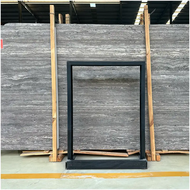
| Light with Linear Veins | White wooden marble | Feature walls, islands, shower walls, long corridors | Visually stretches the space, adds subtle movement without feeling busy | Veins can hide fine scratches; direction of grain must be planned during layout |
| Warm White / Cream | Dover White–type marbles | Living rooms, hotel lobbies, reception areas | Soft, welcoming atmosphere, pairs well with warm metals and wood | More forgiving to everyday dust; still needs pH-neutral cleaners and regular sealing |
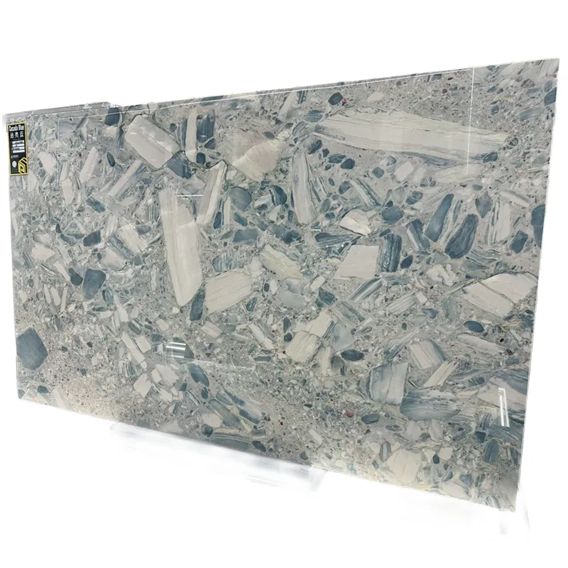
| Medium Grey & Taupe | Grey-veined white marbles, soft taupe stones | Islands, fireplace surrounds, powder rooms | Adds depth and contrast, “quiet luxury” accent against light backgrounds | Good at masking minor etching and water marks; honed finish suits heavy-use areas |
| Dark Accent Tones | Charcoal, deep brown, near-black marbles | Coffee tables, bar tops, small vanities, stair details | Strong focal points, frames lighter stones, dramatic evening effect | Can highlight dust and limescale; best used in smaller, well-defined areas |
1. Light base: your long-term backdrop
Most homes feel best with a light-colored base—especially in kitchens, bathrooms and hallways where natural light is limited. Pale marbles with soft grey veining keep the space bright but less stark than pure white quartz or paint.
A good example is a cool, refined stone like pure white marble Ariston. Its clean white ground with gentle grey threads works as a background for almost any cabinet color, from warm oak to deep charcoal. Because it’s neither too blue nor too creamy, it stays relevant under different lighting and styling trends.
2. Medium accents: visual interest, not chaos
Once the base is set, medium-tone marbles—soft greys, beige-greys, or light taupes—add depth without making the room feel heavy. These are perfect for:
-
Kitchen islands that should stand out but not dominate
-
Fireplace surrounds that need to anchor the room
-
Shower feature walls or niches
Here, the key is balance: the stronger the veining, the more restrained you should be with other patterns (tiles, rugs, wallpaper).
3. Dark grounding elements: used with intention
Deep, dramatic marble colors—charcoal, rich brown, near-black—are best used in smaller doses. Think coffee tables, powder room vanities, bar tops or stair details. Their job is to frame the lighter tones, not to swallow the room.
When you combine these three layers thoughtfully, even a highly varied stone collection looks unified and deliberate.
Reading the Veins: Linear vs Cloudy Patterns
Color is only half the story; vein direction and pattern type change how the color reads in a room.
Linear, wood-grain style marbles create energy and direction. They can elongate a space or guide the eye toward a focal point. Cloud-like, flowing patterns feel softer and more relaxed, ideal for spa bathrooms and calm living areas.
A good illustration of linear elegance is white wooden marble. Its horizontal grain can:
-
Stretch a bathroom visually when used on walls
-
Emphasize the length of a kitchen island
-
Create a subtle “hotel corridor” effect in long hallways
Because the background is light and the veins are fine, it gives you movement without feeling loud—especially when paired with simple cabinetry and quiet flooring.
For projects that need more texture underfoot, the same character works beautifully on floors. Running white wooden marble lengthwise in a narrow space, or diagonally in a square room, can change how the room feels without adding more colors or heavy décor.

Case Study: How Marble Colors Saved a “Too Bright” Show Kitchen
A recent FOR U STONE project involved a show kitchen that originally specified pure white everything—walls, cabinets, worktops, even floor tiles. On paper it looked clean. In reality, it felt clinical, and every speck of dust showed instantly.
The design team rebuilt the palette using three carefully chosen marbles:
-
A calm, pale base material on the perimeter tops and splash.
-
A more structured linear stone on the island and floor.
-
A slightly warmer white for the adjacent dining wall.
They tested several options before settling on a combination that included Dover White marble slabs. This stone brought:
-
A gentle cloud of warm white and grey tones
-
Just enough movement to break up large surfaces
-
A softly reflective finish that worked under both daylight and evening lighting
The result: the kitchen still photographed bright and airy, but felt far more welcoming in person. Visitors commented on the “soft gallery” feeling rather than the “laboratory white” that the original scheme was heading toward.
For floor and wall combinations in other parts of the house, the design later introduced Dover White marble tile, using different formats and finishes to keep bathrooms and corridors consistent with the kitchen without feeling copied. In similar projects, designers often specify Dover White marble tile for wet areas and secondary spaces where modular sizing and easier installation are critical.
From Color Charts to Real Stone: Why Supplier Expertise Matters
Color charts and digital renderings are helpful, but they can’t tell you how a marble will behave in real life: how it will reflect light at 8 a.m., hide crumbs at midnight, or coordinate with your floors when the sun shifts.
That’s where a specialist supplier becomes part of the design team. A company like FOR U STONE doesn’t just ship slabs; it curates blocks, manages finishing, and helps clients match stone choices to actual usage scenarios.
Recent updates from industry bodies such as the European Stone Trade Association (ESTA) have praised manufacturers who:
-
Track quarry sources and blocks for consistent color
-
Invest in safer cutting, polishing and dust-control systems
-
Provide clearer technical data to architects and owners
FOR U STONE’s team fits this profile. Their engineers and project managers work with international designers to balance marble colors with technical requirements such as slip resistance, structural loads and long-term maintenance.
If you want to understand their approach in more depth, their story, values and project experience are outlined on the about FOR U STONE page, which is written for architects, developers and fabricators rather than just end users.
Planning Your Own Marble Color Story
Whether you are refreshing a single bathroom or designing an entire multi-unit building, you can use a simple process to get marble colors right:
-
Start with function, not just style.
-
Where will water stand on the surface?
-
Which areas get direct sunlight?
-
Where do shoes, suitcases or chairs drag across floors?
-
-
Define your base tone.
-
Cool whites and greys work with stainless steel, chrome and black accents.
-
Warm whites and soft beiges pair better with brass, bronze and natural wood.
-
-
Place your drama carefully.
-
Keep the boldest colors or veins in one or two focal points.
-
Use calmer stones elsewhere to give the eye a place to rest.
-
-
Think in transitions, not isolated rooms.
-
Let a marble vein or color reappear in subtle ways from space to space.
-
Repeat a stone as a smaller accent if budget or maintenance is a concern.
-
Designers who follow this flow tend to make fewer last-minute changes and enjoy smoother approvals with clients and project owners.
When a project moves from concept to tender stage, having a conversation with the factory team is crucial. FOR U STONE encourages architects and buyers to contact their specialists early, so they can align color selections, formats and finishing with available blocks and production schedules.
|
|
|


FAQ: Common Questions About Marble Colors in Modern Interiors
1. Are light marble colors harder to maintain than darker ones?
Not necessarily. Light marbles show certain marks (like red wine or coffee) more quickly, which can actually be an advantage—you see the spill and wipe it up before it becomes a problem. Dark marbles may hide stains but can highlight dust, limescale and cleaning streaks. The real maintenance difference comes from finish (polished vs honed) and sealing, not just color.
2. Which marble colors work best in small spaces?
Smaller rooms usually benefit from light to mid-tone marbles with gentle veining. Pale stones reflect more light and visually expand the space. If you want drama, keep it on one feature wall, vanity front or shower niche instead of wrapping the whole room in a high-contrast stone.
3. How do I mix different marble colors in one project without clashing?
Start by choosing a dominant family—cool or warm—and stick to it. Then vary only one element at a time: either shift the value (light vs medium) or the pattern (cloudy vs linear), but not both in every room. Repeating the same marble in different formats (slabs, tiles, mosaics) can also unify the design.
4. Are warm or cool marble colors more “future-proof”?
Both can be timeless if you avoid extremes. Very blue-white stones can feel cold in north-facing rooms, and very yellow creams can look dated if the rest of the décor shifts cooler. Balanced neutrals—whites with soft grey veins, light greys with a hint of warmth—tend to bridge different styles and furniture trends more easily.
5. What should I ask a supplier before finalizing marble colors?
Ask to see real photos or samples from recent projects, not just the best marketing images. Request information about block variation, recommended finishes for your application, and maintenance guidance specific to your chosen stones. A reliable supplier should be able to walk you through strengths, limitations and realistic expectations for each marble color.
Let Marble Colors Support Your Life, Not Dictate It
Choosing marble colors is not about chasing the latest hashtag or copying a showroom vignette. It’s about designing a long-term relationship between stone and everyday life. When you treat color as part of a broader strategy—balancing light and shadow, calm and drama, function and feeling—marble stops being a risk and becomes one of the most stable elements in your project.
FOR U STONE’s portfolio shows this repeatedly: homes, hotels and offices that still look confident years after installation because their marble colors were chosen with both the eye and the expert in mind. If you approach your next specification the same way—testing ideas, studying veins, and partnering with a knowledgeable factory team—your marble will do more than decorate a room. It will quietly hold the entire design together, day after day, year after year.


